Japanese Bedridden Drinking/Sipping Cup
PACKAGING REDESIGN / JAPAN TRIP 2026 / CELESTE REHEISER & DECLAN KUEBLER
// goals
Adapting a Japanese medical aid product for the American consumer market.
// the product
A specially designed spouted drinking cup. Helps bedridden individuals drink water and take medicine without sitting up. Its ergonomic spout allows controlled sipping while lying flat, with a lightweight, easy-grip body for caregivers or patients to hold.
Target consumer: elderly patients, post-surgery recovery, caregiving families. Product type: medical aid / home care. Origin market: Japan. Key function: reclined hydration.

// original packaging
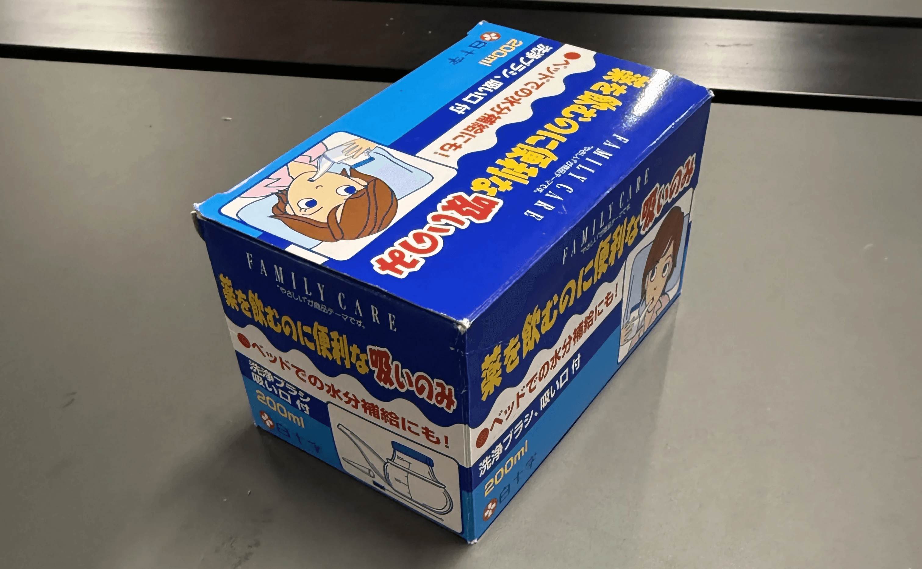
Compact box with a red/white/blue/yellow color scheme. Japanese text explaining the product across all sides of the box. Cartoon-style illustration of product usage on the front.
// US consumer perspective
01 / No window, no product visibility
US consumers expect to see or clearly visualize the product. The closed box gives no indication of what’s inside.
02 / Product not front & center
The actual cup/spout is not the hero of the packaging. American packaging tends to put the product itself prominently up front.
03 / Visually unengaging for unfamiliar consumers
People who’ve never seen this product won’t understand it and may overlook the product. The package needs to catch the eye and communicate function instantly.
04 / Cluttered information layout
Info is scattered across all faces of the box. US consumers expect a clean back panel with consolidated details.
05 / Cartoon illustration style
The graphic style could come across as juvenile to American buyers. A more realistic, clinical illustration would read as more trustworthy.
// the redesign
Window / Cutout
Added a clear window so the product is visible inside the box.
Product as Hero
Large front-panel display of the actual cup, prominent and clear.
Realistic Illustration
Replaced cartoony art with a clean, realistic graphic of the product in use.
Consolidated Back Panel
All usage info & care instructions moved to the back in a clear layout.

// what we kept
Red / White / Blue Color Scheme
Red and white read as medical in the US too — strongly associated with first aid, hospitals, and pharmacies. Blue adds a calming, water-like feeling that reinforces the product’s hydration function. The palette transfers naturally across cultures.
Usage Example Graphics
The original had an image showing how to use the cup. We kept this because visual instructions transcend language barriers and are especially important for caregiving products where correct use matters.
Care / How-to-Use Information
Cleaning and usage instructions were valuable. We kept all this content but reorganized it into a cleaner, more scannable format on the consolidated back panel.
// a culturally thoughtful redesign
The Japanese bedridden drinking cup is a genuinely useful, thoughtful product. Our redesign simply changes how it communicates to an American audience.


